If you have a website, it is important for you to know that its content should always support the message you want to convey, whether through images, eye-catching text, or strategically placed buttons. That is why you should pay close attention to where the most important aspects of your information will be placed, as this will ensure that visitors convert on your site (for example, buy your products, contact you, or leave their email so you can send them valuable information).
But how can you achieve this? Fortunately, there are already different rules or “patterns” that will help you resolve your doubts and make your task easier, and here we will review the most common ones:
Patrones de diseño web
First, let's explain a little bit about this term, since you've probably never heard it before: A web design pattern is a certain way of distributing the visual elements of a page, optimizing the relationship between them. And although each person can choose how to distribute their content without taking into account a pattern from the beginning, the design patterns that already exist are the most effective way to convey your message or achieve an action from the user, and they also improve the usability of our websites.
In short, these patterns help us prioritize and define which elements are most important within a web page and therefore, what should attract the customer's attention the most. This way, we will always have the right attention in the right places.
Los patrones de diseño más usados
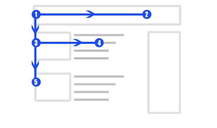
- Z design pattern: When we visit a website for the first time, we scan the content quickly and make an eye movement similar to the letter “Z.” With this in mind, a page that uses this pattern usually places its logo in the upper left corner so that it is the first thing that the user notices. In front of the logo, in the upper right corner, the navigation menu and a call to action, such as a sign up, contact or purchase button, are usually placed:

The final part of the Z is the conclusion of everything that was presented on the page, so you need to encourage them to take action. Place an attractive button that draws attention (“buy now”, “sign up”, “contact us”, etc.).
- Full Image Web Design Pattern: This web design pattern includes little text over an image that usually takes up most of the screen. This serves to capture the full attention of your users and generate a great visual experience from the start. In addition, it communicates your message immediately, since with a simple image you can express what you do, who you are and what you offer. In this type of design you should always accompany your cover with a striking explanatory phrase or a slogan that represent you.

- Design Pattern F: This design pattern is based on a form of page scanning, just like the first point we explained. The difference between the two is that this one is (generally) applied to text-heavy pages, such as blogs or informational sites. For this type of design, it's best to invest most of your effort in the top section of your page and then reinforce the message in the middle. This way, your visitors will be clear about what your message is without having to read too much.

- 4. Single column design: This design is very simple and straightforward, as it relies on simple navigation that only requires you to swipe down to continue reading (like in the Facebook feed or in this blog post).
In this type of design, you should always add a “back to top” button if your content is extensive, or alternatively, add a fixed menu to improve navigation. This way, your visitors won’t have to make a big effort to go to other sections or return to the beginning.
Now that you know the four most common web design patterns, which one do you apply to your website or which one would you like to try? Go ahead and implement this information and check out the results!


